Pepsi, Target, and countless others went circular for a reason. Sure, it’s versatile and soft—but there’s much more behind this timeless shape than meets the eye.
Circular logos aren’t just visually appealing—they carry deep meaning, practical advantages, and unmatched versatility in today’s digital world. From Target’s iconic bullseye to Starbucks’ emblem and the sleek app icons of Spotify, Google Chrome, and Instagram, circles are a go-to shape for brands across industries.
The Psychology Behind Circles
Circles convey more than aesthetics—they communicate emotions and values that resonate universally:
-
Unity & Wholeness
A circle has no beginning or end, symbolizing completeness and harmony. Brands use circular shapes to evoke inclusivity, continuity, and a sense of unity. -
Community & Connection
Overlapping or linked circles suggest bonds, social connection, and shared values, making them ideal for community-focused brands. -
Movement & Energy
Circular patterns, arcs, and spirals convey motion, adaptability, and progress. This is perfect for brands that want to signal innovation and growth. -
Softness & Approachability
Unlike sharp-edged shapes, circles feel gentle, safe, and inviting. Bubble-like logos convey friendliness and accessibility. -
Spiritual & Natural Associations
Circles reflect natural forms like the sun, moon, or water ripples. They suggest balance, rhythm, and timelessness, giving logos a universal, almost spiritual resonance.
Practical Advantages of Circular Logos
-
Scalability Across Formats
Circles retain their form and recognizability at any size, from tiny favicons to massive billboards. Simple circular logos remain legible and striking even in low-resolution digital formats.Examples:
-
GE: The hand-scripted “G” and “E” inside a circular frame remain clear and elegant across all scales.
-
National Vision: A circular icon inspired by the iris ensures instant recognition and translates seamlessly across print and digital platforms.
-
-
Perfect Fit for Digital Platforms
Circular logos integrate naturally with modern UI elements:-
App icons on iOS and Android are round
-
Profile photos on social media platforms like Instagram, WhatsApp, and Slack are circular
-
Circular logos avoid cropping issues and maintain brand consistency across digital touchpoints
Examples:
-
Target: The bullseye is instantly recognizable and fits seamlessly in circular app icons
-
Obama Foundation: The rising sun within a circle symbolizes hope and progress while adapting effortlessly to digital formats
-
Crunchyroll: A circular swirl suggests motion and aligns with digital platforms, maintaining brand identity
-
-
Ideal for Motion and Animation
Circles are naturally suited for animation—spins, ripples, rotations, and bounces feel intuitive and fluid. Circular forms enhance dynamism in motion graphics, making brands appear modern and engaging in digital media.

Circles in logo design have a deep cultural and emotional value, ideal for both digital platforms and print materials
Let’s break down the ‘circle logic’ behind modern branding and explore why so many successful companies go round when it comes to design.
The Psychology of Circles
Circles have always been associated with ideas like wholeness, balance, and continuity. In branding, the shapes help convey emotional messaging that influences how we feel about a product or company.
1. Unity & Wholeness
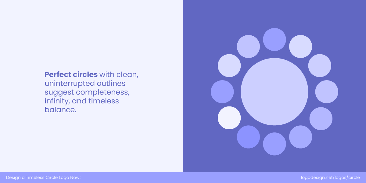
A perfect circle in the middle and smaller circles on the side represent an endless loop and completeness
Circles naturally represent wholeness and continuity; there’s no beginning or end, just an endless flow. That’s why they’re often used by brands that want to convey harmony, unity, and inclusiveness.
2. Community & Connection
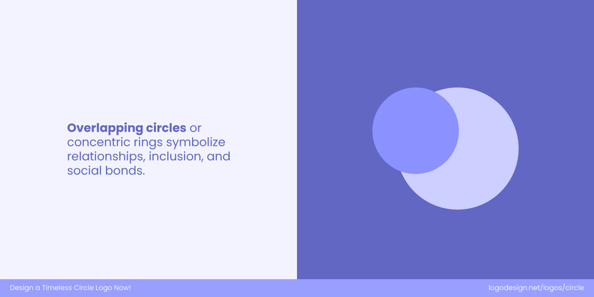
Overlapping circles suggest inclusion and are used to show social bonds
Since circles have no beginning or end, they naturally stand for connection and unity. In branding, they highlight shared values and relationships, which is why many social or community-focused brands lean toward circular designs.
3. Movement & Energy
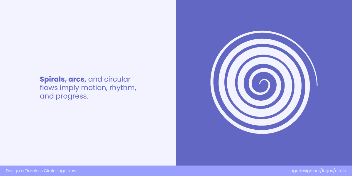
Spiral arcs show motion and progress
The round shape of a circle gives off a sense of movement and flow. Spirals or circular patterns often symbolize progress and adaptability, making them perfect for brands that want to convey energy, innovation, and growth.
4. Softness & Approachability
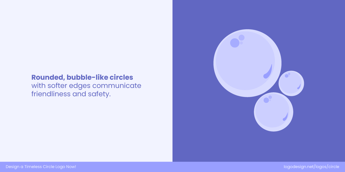
Bubble-like circles, with soft edges, show friendliness and safety
Unlike shapes with sharp edges, circles naturally feel soft, safe, and inviting. Their gentle form gives logos a human touch, helping brands appear more approachable, friendly, and easy to connect with.
5. Spiritual & Natural Associations
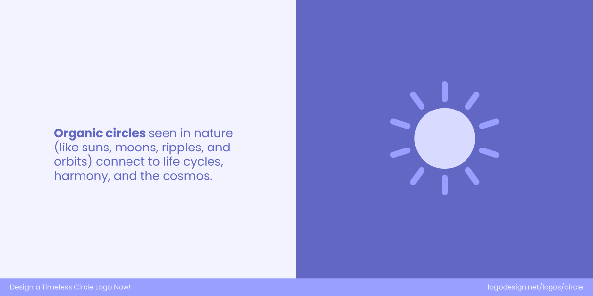
Organic circles that are used to form natural elements suggest connectivity and harmony
Circles are everywhere in nature, from the sun and moon to the ripples in water. They represent rhythm, eternity, and balance, giving brands a timeless, universal, and almost spiritual visual language.
Why Circles Make Powerful Brand Symbols?
The psychology of circles might explain why they feel right. But in the modern world of digital-first branding, there are also practical reasons why circles are dominating visual identities.
1. Circles Scale Beautifully
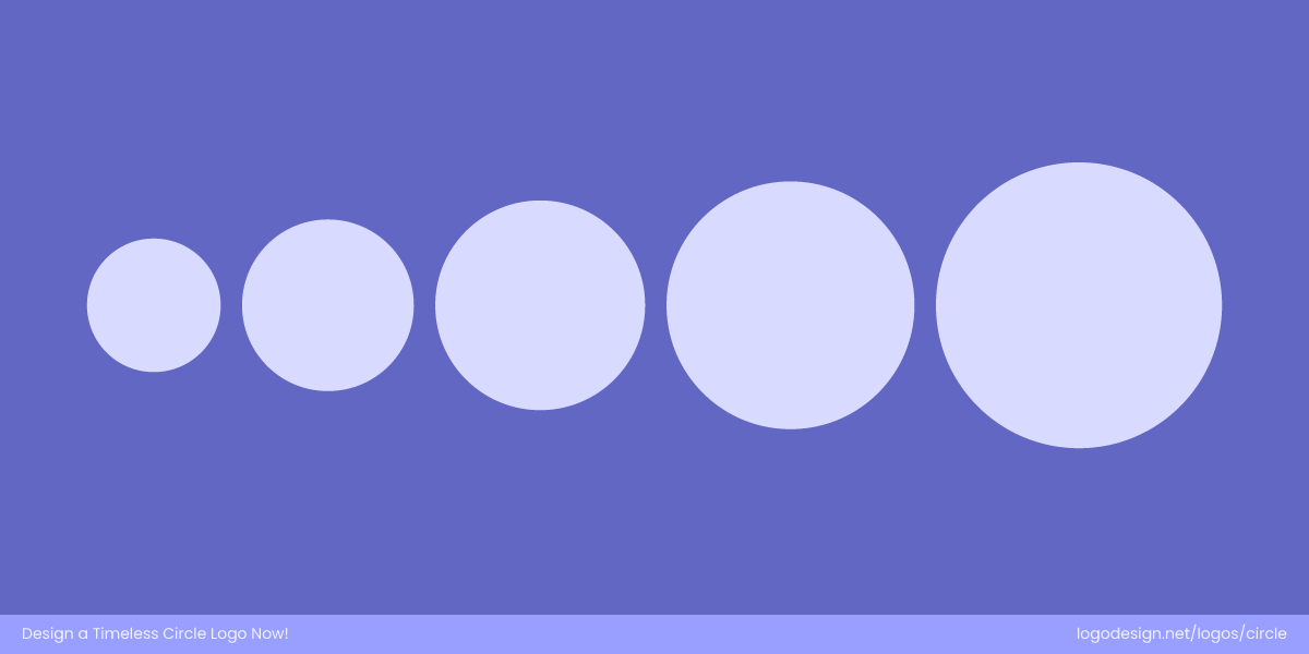
Scaled circles presented in an order work well across differently-sized screens
One of the key challenges in brand design today is scalability. Your logo needs to work across multiple formats and sizes. This includes mobile screens, smartwatches, browser tabs, digital ads, business cards, packaging, and even billboards.
Circles maintain their appearance at any scale. They’re immediately recognizable, even in small or low-resolution formats. Unlike text-heavy or complex designs, a simple circular logo remains clear and functional, be it a 16×16 pixel favicon or a moving advertisement on the side of a bus.
The GE monogram logo has stylized G and E letters and a circular border, along with a blue background to retain the brand’s identity
The GE monogram features a hand-scripted “G” and “E” nestled inside a decorative circular frame. The looped letters flow into each other with elegant swirls, giving a feeling of continuity and craftsmanship. The circle keeps the entire design contained — making it recognizable whether on a giant billboard or a tiny device. Even reduced to small sizes, the blue round holds its shape and retains the brand’s identity due to the strength of that circular enclosure.
The National Vision wordmark logo features a circular icon that shows simplicity
National Vision’s refreshed logo features a circular icon inspired by the iris of an eye, complemented by sleek, modern typography. The circle perfectly represents vision and clarity, echoing the brand’s mission of accessible eye care. Its simple, balanced shape ensures instant recognition, whether on store signage or tiny app icons. The design’s clean geometry translates seamlessly across digital and print media, maintaining its sense of trust, precision, and visual harmony in every format.
2. Circles Fit the Digital World Naturally
Modern UI design is quite circular if you look closely. From app icons on smartphones to profile pictures on social media, digital platforms feature circular frames to improve user experiences. So when your brand has a logo in such a shape, it fits quite well into these spaces without cropping or resizing.
For example:
- Instagram stories display profile pictures in circular forms
- iOS and Android both use rounded icons for apps
- Platforms like WhatsApp or Slack show contact photos in circles
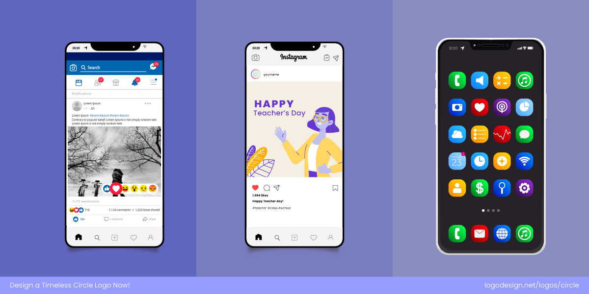
The circular logos shown across different digital screens
A circular logo is pretty much pre-optimized for digital use, making it quite suitable for brand consistency across platforms. Target’s bullseye logo shows how being ‘circle-native’ makes it fit well on apps like Instagram and TikTok, where the brands have to display their icons in circular forms.

The Obama Foundation uses a circular rising sun logo that suggests hope and progress across various promotional items – Source: Instagram/obamafoundation
The Obama Foundation logo uses a rising sun within a circle, symbolizing hope, progress, and unity. Its circular form makes it instantly adaptable for digital platforms—whether as a favicon, app icon, or social profile—retaining both clarity and symbolism even at small sizes.

The Crunchyroll’s swirl logo is used across various branding items to suggest motion and flow – Source: Instagram/crunchyroll
Crunchyroll’s circular swirl logo is designed with motion in mind, echoing the flow of anime culture. Because it’s inherently round, the logo sits naturally in digital spaces like app stores, streaming platforms, and social media, ensuring strong brand consistency across touchpoints.
3. Circles Are Born for Motion
With video content and motion design becoming one of the main elements of branding, the ability to animate a logo or brand element matters more than ever. Circles offer natural motion pathways like spins, ripples, rotations, and bounces. Such effects feel intuitive and interactive when applied to circular forms.
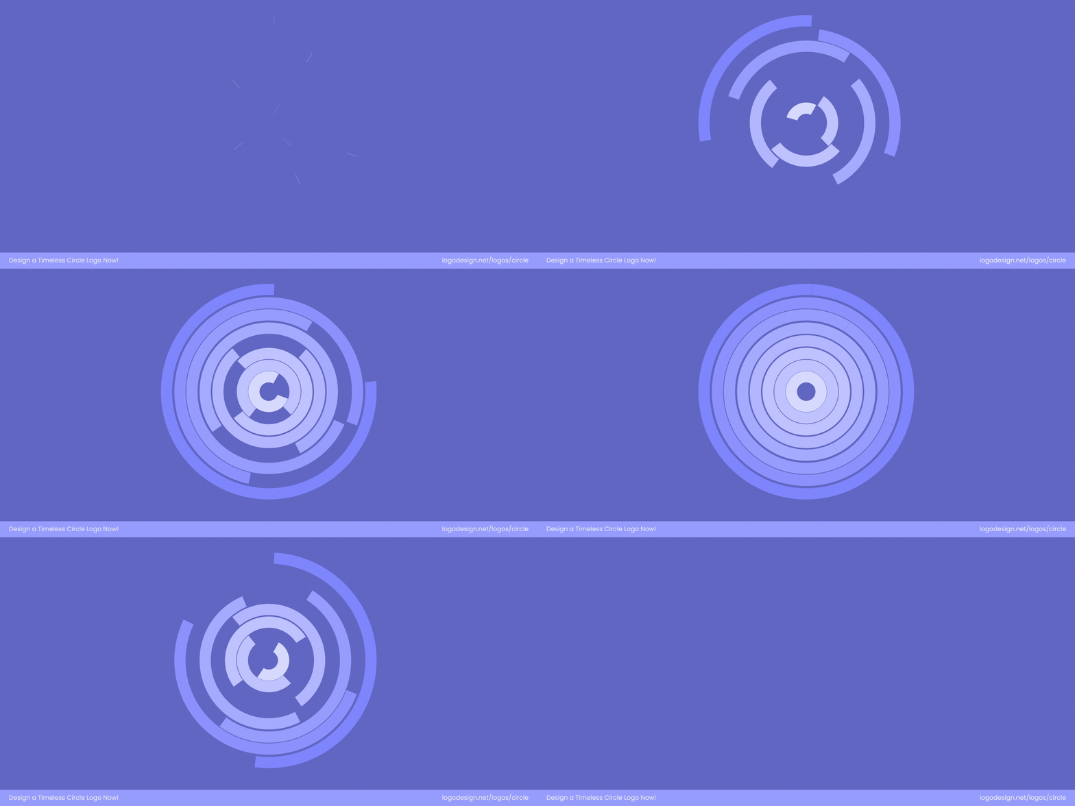
Animation circular forms suggest movement that feels modern
Animation with circular elements feels fluid and continuous, aligning with the psychological concepts of movement, life, and evolution. This adds an extra layer of dynamism to brands that want to feel modern and engaging in digital media.


